“We always test to see what visitors like”
Of course, there may be other tactical ways to come up with compelling lead generation strategies, but most of the digital marketers rely on AB testing and they have actually developed a “we should test this and test that” mentality.
In times like these, your site has to remain relevant and keep on generating leads. So, if you need some AB test ideas, this article could be just what you needed.
But before we delve into any of those, let’s talk about lead generation first. The starting point would be to define a lead and then we will cover what a lead generation is.
So, a lead is a potential customer that shows interest in your company’s products and services. In most cases, after submitting personal information, leads are then contacted by the company’s salesperson and the actual transaction takes place offline.
Let’s say you fill out this Invesp form and submit the required information. Within a few minutes, you receive an email or a phone call from one of Invesp’s business development team asking you how they could help you increase your website conversion rate. Had you not submitted your personal information on their form, the business development team wouldn’t have known that you are interested in our services. So you have become a lead.

Now, the process of attracting and getting potential clients to submit their contact information is what is referred to as a demand generation. Among others, IBM and Oracle are good examples of lead generation websites.
A recent study indicates that three-quarters of online businesses do not know how to measure their lead generation efforts properly. There is more to measuring the success of your lead generation campaigns than just looking into the volume of leads generated. As a digital marketer, you will need to track and monitor these lead generation metrics:
- Click-Through Rates (CTR)
- Conversion Rates
- Time to Customer Conversion
- Cost Per Customer
Trying to determine what to include on your page so as to attract and convert strangers into potential customers can be overwhelming at times. Companies often miss lead generating opportunities by forgetting to run a split test on their pages. This article presents to you 15 AB tests ideas that you should consider if you wish to attract more leads.
Value Proposition
I’m sure you know that a well-articulated written value proposition that resonates with your target market will give your business an edge over its competitors. Many companies would like to think that their value proposition is good enough to compel users to become interested in the products or services on offer, but according to this study, most of the companies are doing it wrong.

What is a good value proposition then? What does it look like?
Well, a good value proposition persuades visitors into becoming interested in your products or services by giving them a summary of how the products or services will benefit them. IBM is a good example of a lead-gen site that has a value proposition that is successful in converting leads to customers.
It’s not an easy task to come up with a value proposition that will appeal to leads and make them convert to customers. But fortunately, there is a cheat code to this, and it looks like this:
- Interview existing customers and past customers to understand why they chose to use your service
- Categorize responses into different groups
- Validate insights from existing customers by surveying site visitors to see which of the categories resonates with them
- Run AB tests to see which of the value proposition increase your conversion rates.
Landing page layout
The layout is one of the many experiments you can conduct on your landing pages. By layout, I mean the way in which the elements are set out or arranged on the page.
Every website has its own set of a targeted audience and there are several layout designs you could apply on your page. Some websites prefer a detailed landing page, while others go for a general landing page.
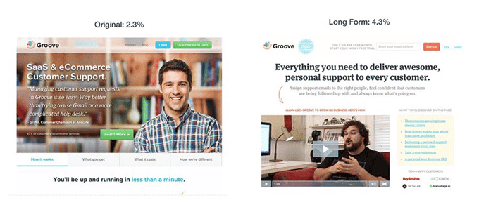
For example, Groove conducted customer interviews and captured the words customers use. From the results obtained, were used to write the copy of the landing page (using the customers’ own words) and the page layout was redesigned after the copy was finalized. The conversion rate increased from 2.3% to 4.3%
When it comes to boosting conversions, there is no right or wrong strategy and what works for other companies, in the same space as yours, may not work for you. This is why you should constantly run a test and see what really works for you.
Self-identification vs. no self-identification
Self-identification refers to the way you see yourself or rather the way you describe yourself. There are endless ways you could use to ask your visitors to self-identify themselves. You can ask your visitors to identify themselves by role by their job role or persona and industry or company size.
As different as the people who visit your site, so are their self-identities. For instance, a marketing agency can serve different audiences differently —in such a case, the company may need to ask potential clients to identify themselves so that the sales team will have to personalize the offer to address the client’s existing needs.

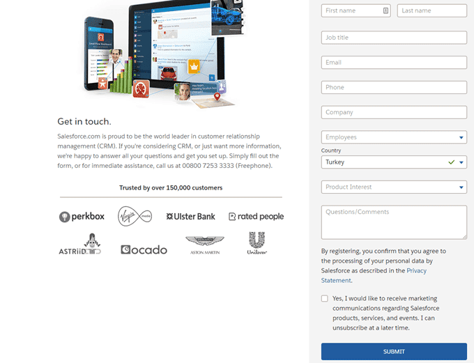
Image Source: Oracle
A good example of a website that uses this self-identification tactic is Oracle — they ask potential customers to identify themselves by choosing their area of interest as shown in the above image.
Just as in real life, people are reluctant to give their personal information, and sometimes asking strangers to self-identify themselves can just chase them away, this is why you have to split test before making any final decision.
Need Identification
Need identification is a basic selling technique that involves discovering customers’ pain points, requirements and constraints. The information gathered using this technique is then used to negotiate and close a sale.
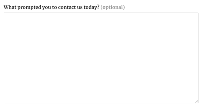
Some of the B2B company websites that offer a wide range of services or that have clients of different sizes often include a field, in their form, that asks customers to identify their needs. Most likely you have noticed a field in a form that asks you this: “What prompted you to contact us today?” or “How can we help you?”
Title/headline Language
It only takes less than three seconds to establish and enhance visitors’ confidence and trust in your site.
One way of doing that is by making sure that the headlines used are catchy.
A well-crafted headline informs the visitors just enough to take a certain action. Needless to say, a headline can turn a lead into a sale or it can decrease your lead conversions.
In most cases, there are two types of headlines used in websites —the first type is placed just above the image, and the second one does not need any image. If your website is all about converting leads into customers, then you don’t get to assume the one to use, you allow AB testing to take the lead and inform your decision.
If you know which type of headline to go with, you might as well need to test the phrasing of your headline. Viral media websites such as Upworthy test about 25 headlines per article, but you don’t have to go as far, especially if you don’t have a lot of traffic and according to this statistical calculator, every headline needs about 10 170 visitors to become statistically significant.
Number of Fields In the Contact Form

It’s often emphasized that the fewer the number of fields in a form, the higher the conversions. This practice was cemented in 2011 when Marketing Experiment reduced the number on its signup form and the result was an increase in conversions.
It has now regarded as the golden rule of web optimization, and this is why Unbounce’s Oli Gardener, had to say this:
If you want to increase form conversions, you must consider reducing the number of fields. If you really need extra info, consider doing an a/b/c test where you compare all of your fields with the absolute minimum and a half-way version to determine which converts best – and then weigh it against the value of the extra data collected, and see how it will impact your post-click marketing.
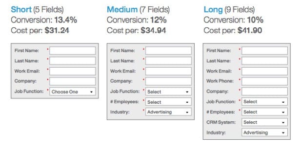
Image Source: Marketo
But with digital marketing, nothing can ever be straightforward. Some case studies have revealed that long(ish) forms can also have a high conversion rate. A good example is Salesforce, their form has 10 custom fields and one tick box.
So, this brings us to this question: How many fields on your lead gen form is too many?
Well, it depends. When determining the number of fields on your lead generation form, you have to ask yourself these two questions:
- What should I prioritize: lead quantity or quality?
- What kind of information do I require to turn a lead into a customer?
When you now have the answers to these questions on your fingertips, then you design two different forms —and you run a test.
Trust Signals
Trust: you cannot have high conversions without it. You cannot force it or demand it from your web visitors, but instead, you earn it. Naturally, we all need a reason to believe in something before taking action. When it comes to the issue of trust in websites, trust signals can help you put your prospects at ease.
WordStream defines trust signals as:
Trust signals are elements that are often displayed on websites and at physical points-of-sale in brick-and-mortar businesses to help customers feel more secure in their decision to patronize a specific business or buy a specific product or service.
Trust signals can be in the form of guarantees, testimonials, membership trust signals and trust by association.

Image Source: Customer Paradigm
Since they are different types of trust signals, you have to test to see which one will prompt your leads to convert on your site. Depending on the test results, you might as well have more than one type on your site.
Blue Fountain Media added Verisign Logo on their landing page and increased their conversion rate by 42% and signup form entries by 81%. My Energy Solution trust seals on different pages of their site and their registrations increased by 137%. This means that the placement of the seal also has to be tested.
Social proof options (similar to trust above)
Social proof has the same effect as the trust symbols we mentioned earlier. Tucker Schreiber defines social proof as:
It’s a psychological phenomenon where we look to the opinions of others and additional “signals” to help us make decisions. It’s also a powerful persuasion tool you can use in your business to influence potential customers who are trying to make a buying decision.
Whether you are an AB testing expert or a newbie, social proof deserves some attention as they may either increase or decrease your lead generation conversions.
Single vs multi-step form
Depending on the purpose of the form and the volume of information you need from your users, you can either use a single or a multi-step form. But, what is a single-step form and what is a multi-step form?
A single-step form is a form that asks you to fill out all the required information in one go and it is usually longer by nature. This type of form is beneficial when your aim is to collect basic information such as an email address, name, last name, and website URL.
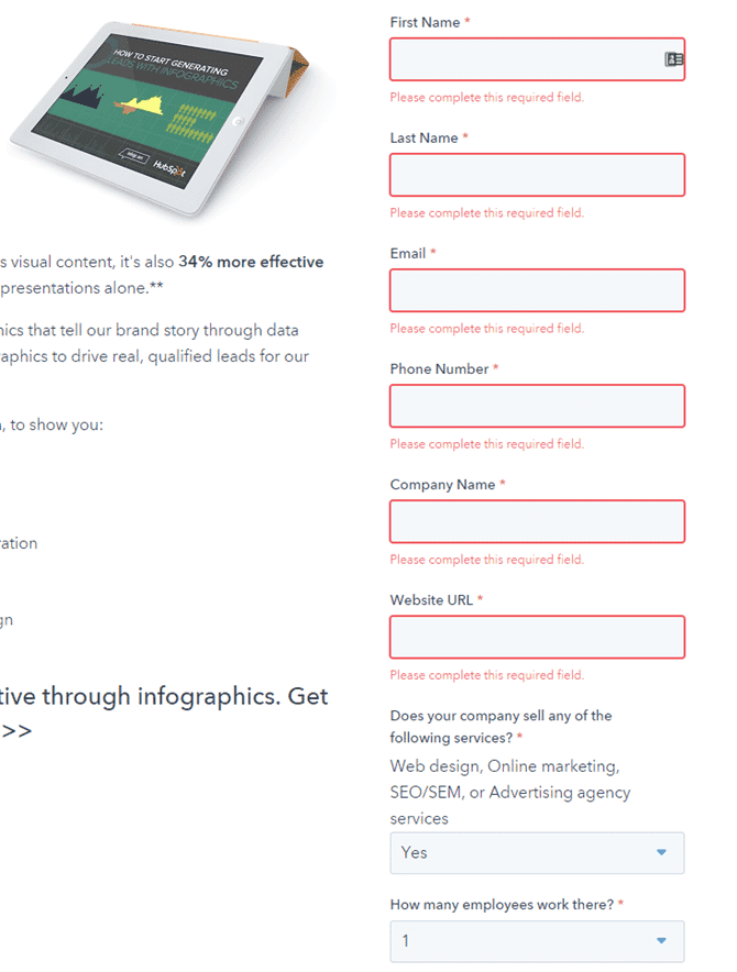
Image Source: Hubspot
By definition, a multi-step is a long-form that is broken into multiple pieces. It can have the same number of questions as the traditional single forms, but it asks for the information in small chunks.
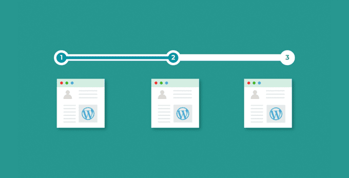
Image Source: WP Manage Ninja
Between the two forms, which one would you prefer to use as a lead generation form?
When used in the right context, either single or multi-step form can help you boost the conversions of your lead gens.
For instance, Venture Harbour, they managed to increase their lead generation conversion rate by 300% when they began using a multi-step form, and on the other hand, there is this case study that reveals a single-step form registering 120% in overall conversions.
So, how do you get it right on your website form?
Yes, you guessed it. You have to test.
The placement of the form on your page
Once you have figured the number of fields to have and the type (single or multi-step) of form to use, then your next thought should be about the positioning of that form.
Believe it or not, the placement of your form can dramatically influence a person’s interest in inquiring about your products or services.
Up until the last few years, marketers have been sold to the belief that a form has to be placed above the folds. The logic behind this idea was that: above the fold content appears first to visitors, and it gets more attention from users.
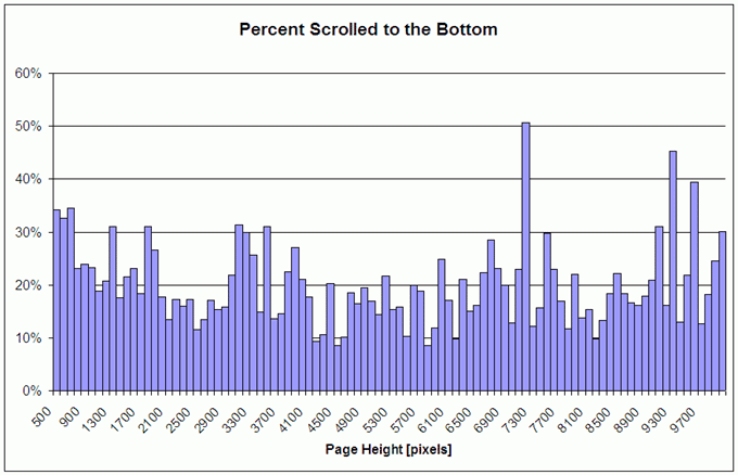
Image Source: Clicktale
But the times have changed, or rather this myth has been debunked. According to a study conducted by Clicktale, 76% of web visitors scroll all the way to the bottom regardless of the page length.
In that regard, Chuck Pearson says:
People scroll before the page is fully loaded and therefore the content directly below the fold has a higher viewership in many cases than the content above the fold. We can officially get rid of this myth of above-the-fold once and for all. There is no fold!
You can place your form above or below the fold and you will still boost your lead generation conversions, but the placement decision has to be backed by an ab test.
Test the images…do professional images always win?
Besides painting a pretty picture on your website, using images on a site will help attract thousands of people to your site. Studies have shown that any web pages that have images get 94% more views than pages without.
But since images come in different types, which type should you go with?
From a psychological point of view, professional photos perform better than gifs, cartoons or any other visual elements. This is because they can help build trust, capture authenticity which ultimately generates more leads.

However, this doesn’t mean that you have to rule out other types of images, this is why you must test different image variants whenever you think of adding images on your page.
Copy length: Long vs. short copy
If you have been following a number of digital marketing blogs, you will notice that there is no consensus among marketers when it comes to the copy length.
Long copy fanatics believe that more copy means more sales, while the short copy advocates say that there is no reason to write long copies because people do not want to read.
Well, let’s see what QuickSprout say about this:
When a brand is well-known, it doesn’t need as much marketing copy as a new brand does…when people don’t know much about your brand, you’ll have to create marketing copy that is longer. The reason for that is that when people aren’t familiar with your brand, they tend to have more questions and concerns.
Although this sounds reasonable, it doesn’t mean that you have to eliminate AB testing — you will still have test the response rate of your copy to see which converts at a higher rate between a long and a short copy.
Video vs. No video
People would rather prefer watching a video than reading a text that explains the same product or service — but is it always the case?
Fathom, a marketing agency wanted to add some visual content on the website of one of their clients, Brookdale Living. The agency didn’t know which element, between a video and a static image, was going to help boost conversions.
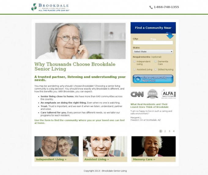
Image Source: VWO
So they created a version of the page with an image and another with a video. And they tested the two variants.
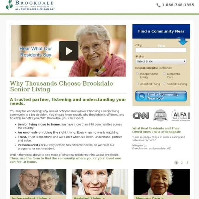
Image Source: VWO
Guess which variant was the most popular and most and was more engaging?
No, you are wrong.
In fact, the variant with an image outperformed the variant with the video and the former had an increase of 3.92% in conversions.
The truth, you never know what is going to work on your website until you A/B test it —sometimes even the well-researched hypothesis fails.
Qualifying the leads (lead quality vs. lead quantity)
Having “more leads” is great, but having “better leads” is much sweeter. The way you design your lead generation strategy will determine whether you are after quantity or quality, or both.
Lead quality can be defined as a type of a prospective customer/client who has shown interests in your services or products and has the means (finances or authority) to do so.
A form that generates a high-quality lead goes beyond asking for a lead’s name and email address —they also have additional fields that require the job position, company name, phone number, etcetera.
You have to test different form designs to see which one generates more quality leads. But it’s wise to strike a balance between the two because for you to have quality leads, you need to begin by attracting enough leads —and thus is where lead quantity steps in.

Having more information makes it easy to quality leads and it actually lightens the job of your Sales rep as it gives them a more vivid direction of their next step.
Incremental vs. Radical test
Sometimes testing and changing one element at a time can be time-consuming. It can actually take several months to have actionable results. But if you want fast results, that can take you two weeks or less, you can opt for a radical redesign.
Radical test is when many web elements are tested at the same time, whereas an incremental test refers to the testing of singular elements at a time.
For example, instead of testing a single image or form placement (incremental testing), you can run a radical test where you can test different fonts, images, value propositions, colors and form placements at the same time.
Let’s say you run a radical test and you notice an increase in conversions, how then will you know which element contributed the most and which elements were less effective?
Well, this you wouldn’t know, and this is why a radical test is an all or nothing tactic!
Parting words…
One of the best things I like about AB testing is that it often hits you with surprises, no matter how often you run it. AB testing seems so complicated, but there are AB testing tools such as FigPii that can help to make it easy for you. If you use some of the above ideas you may be able to provide a better experience to your visitors, and this may result in increased conversions.