


What Is Heuristic Evaluation?
The word heuristic refers to a rule of thumb adopted based on experience or common knowledge. Ultimately, a heuristic evaluation is based on rules that represent best practices for what a website should include.
As a usability method, heuristic evaluation identifies usability problems on a website and helps inform targeted improvements. It is a valuable technique because it provides quick feedback and is extremely cost-effective.
About 20 years ago, when Jakob Nielsen first introduced this method, conducting a heuristic evaluation was mainly a form of walking through a website looking for instances that violated the heuristics he introduced, followed by a critical stage where a team of experts got together and decided on what the important changes were to go forward with from there.
This practice has changed since then, and now, each organization shapes this technique in accordance with its purposes and needs.
Heuristic Evaluation For Conversion Optimization
Heuristics or heuristic evaluation is one of those terms that have become associated with conversion rate optimization projects. Whether you are a CRO expert or new to this field, you have certainly spotted the high recognition heuristic evaluation received among usability testing methods.
Heuristic evaluations are commonly used by most conversion experts. However, remember that you cannot learn the heuristics by heart; you apply them loosely. You need knowledge and resources to conduct an evaluation adequately. Besides, not all heuristics are applicable to every website.
This guide provides a full explanation of the 10 heuristics and how they function on a website. Along with the 10 heuristics, we will also explain the elements of the Conversion Framework, our method for conducting the heuristic evaluation of our client’s websites.
To use this technique properly, this article answers many frequently asked questions, such as: What does heuristic evaluation really mean? What are the benefits of doing a heuristic evaluation? What are the 10 heuristics? When should I use it? And how?
Now that we have touched on what heuristic evaluation means in the context of conversion optimization, let’s look at the benefits of heuristic analysis.
Benefits of doing a heuristic evaluation on your website
There are several benefits to conducting a heuristic evaluation of a website. According to this study, the benefits of heuristic evaluation are 62 times greater than the costs.
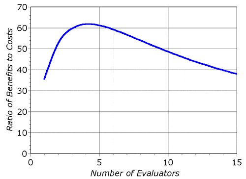
Image Source: nngroup
Compared to other methods, user testing, for instance, heuristic evaluation, is more accurate and detailed, but how?
In user testing, there is usually an observer who is responsible for explaining the user’s actions and inferring the underlying reasons for them, which leaves room for interpretation and guesswork that can be misleading.
Heuristic evaluation is also a great way to obtain meaningful results in a very short time.
Having said that, here’s a list of benefits associated with conducting a heuristic evaluation on a website:
- The whole process focuses on relevant areas of a website—that is, the problems it identifies can help increase conversions.
- Since the whole process involves teamwork, there is a high chance of gaining a wide range of perspectives that can help identify additional conversion roadblocks on a website.
- It is a sound process that assesses a website against very clear criteria.
- The process can help you compare your website to your competitors.
- It can help you create a clear, focused, and simple roadmap of the next steps you need to take.
- Focus on the most crucial customer needs and pain points.
On the other hand, heuristic evaluation comes with its own set of drawbacks. Here’s a list of pros associated with conducting heuristic evaluation:
- The heuristic evaluation process is only as good as the people who conduct it. It doesn’t uncover all the conversion bottlenecks in isolation. Other research methods, such as user testing and analytics, are needed to uncover valuable insights.
- Confirmation bias can creep in if the people evaluating your site are not impartial.
Getting to Know the 10 Heuristics and the Elements of the Conversion Framework
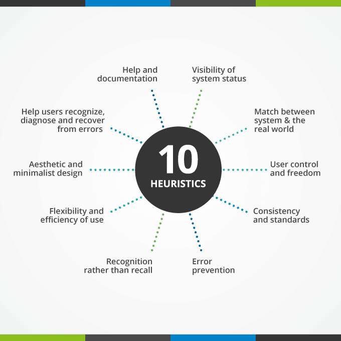
The 10 heuristics are designed to uncover most problems on a website. However, they do not apply to every website, and you can always add or delete anything inappropriate.
At Invesp, we utilize the Conversion Framework to guide our heuristic evaluations. Much like the 10 heuristics of Jacob Neilson, the Conversion Framework is designed to keep all the key aspects that will help uncover website problems. Our framework comprises seven main elements, each broken down into 250 sub-elements we evaluate during a heuristic.
Let’s go over the concepts of the 10 heuristics and the elements of the Conversion Framework:
1. Consistency/Continuity: This principle states that users should not have to wonder whether the different words or situations mean the same thing. To avoid user confusion, always ensure consistency and continuity across your website.
A good example of a lack of consistency/continuity would be the following web pages:
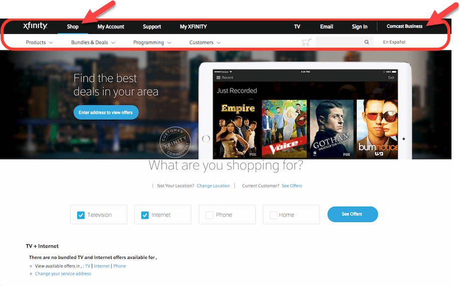
On this website, the navigation layout and wording change as the user clicks to a new page, which is confusing and frustrating.
The wording switches from “Shop” to “Shop/Upgrade” and from “Comcast Business” to “Business.” Users will question whether these categories are the same.
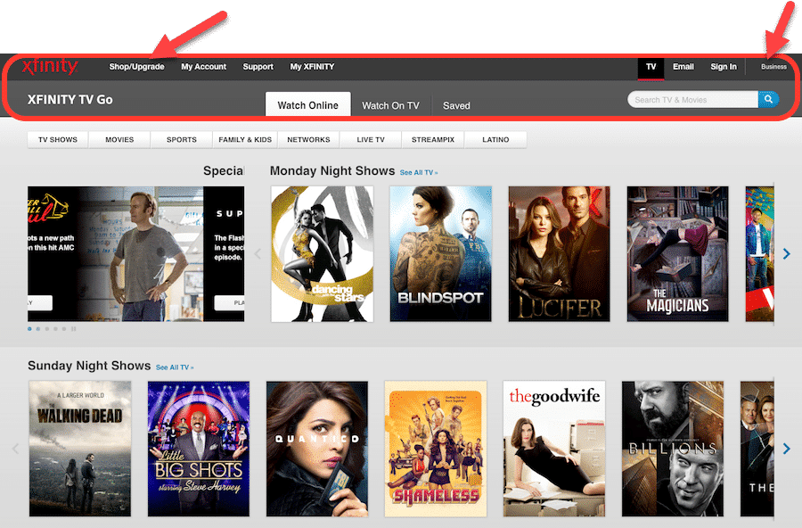
Image source: interaction-design
This first heuristic falls under the Conversion Framework element of Trust. To deliver a better user experience and persuade visitors, you must give them the trust and confidence to proceed. Lack of continuity inhibits trust, which oftentimes prompts visitors to abandon the site. Lack of continuity can occur from an off-site ad to the landing page or from page to page within the same site, as displayed in the example above.
2. The visibility of the interface status: according to this guideline, the website should communicate clearly with the users and keep informing them all the time about what is happening within a reasonable time and provide appropriate feedback.
A simple example of an interface status indicator is the spinning dial when a page is loading.

The second element of our Conversion Framework is FUDs, which translates into fears, uncertainties, and doubts. A lack of communication or understanding of what is happening on the site or the page can cause FUDs and prompt visitors to abandon the site. Clear communication is critical to help visitors proceed.
In the Conversion Framework, visibility of interface status falls into the sub-element called “progress indication.” Visitors need to know their progress or the progress of something loading. Otherwise, they will assume it is broken and leave.
3. Error Prevention: This principle states that a great design prevents users from making errors, and if an error occurs, the website should be able to identify it and help the user recover easily.
An example of error prevention is helping users reset their password in case they forget it.
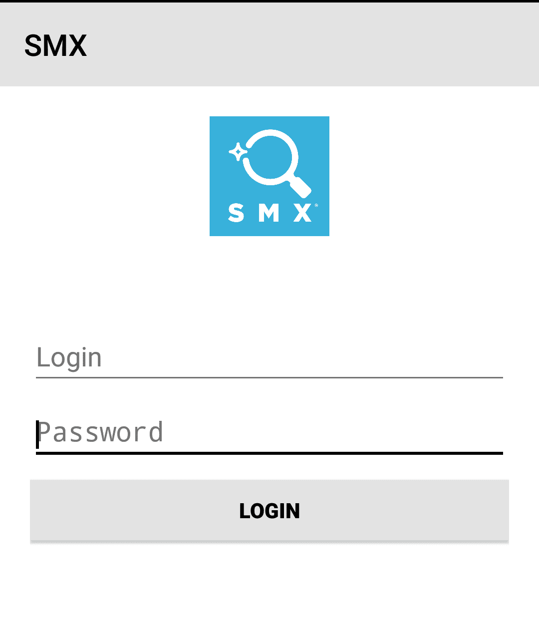
Again, this heuristic would fall under the category of FUDs. Not providing visitors with sufficient error prevention or alternative paths can cause fear, uncertainty, and doubt. This recently happened to me after downloading the SMX app. It presented me with a login screen, although I didn’t have login credentials and wanted to create an account. There was no clear path or information to help me find the Create Account section on the app.
 4. Recognition or recall: This principle states the importance of minimizing the user’s memory load by making all the website’s components more visible and memorable.
It is also fundamental to make website instructions visible and/or easily retrievable.
Look at this example, for instance:
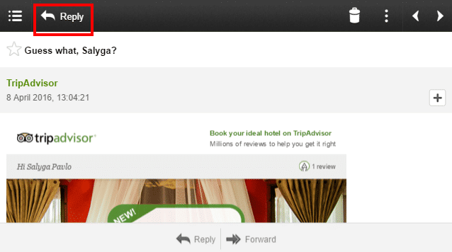
Image source: webdesign
In this example, without the description “reply,” the user would spend a lot of time trying to decipher what the arrow icon means, especially since an arrow typically means “go back” or “previous.” The designer understood this issue, so to make it easier and more recognizable for the user and avoid any confusion, they added a description next to the arrow.
Most of the heuristics fall under FUDs, so we spend a lot of time on this element alone. Although other elements are not to be ignored, when it comes to heuristics, you evaluate the overall flow of the site to ensure nothing is breaking or causing major obstructions.
As I mentioned, this recognition heuristic falls under FUDs, specifically under “instructional guidance.” Visitors don’t always know what certain symbols mean, so you can mitigate this by providing the meaning through either text or a small asterisk or question mark they can click for more information.
5. Aesthetics and minimalist design: This principle states that the website should not contain extra or irrelevant information because it diminishes the relative visibility of the relevant units.

In the above example, the design looks cluttered and boring, coupled with large, irrelevant information that distracts users from their intent and makes them forget why they are on this website in the first place.
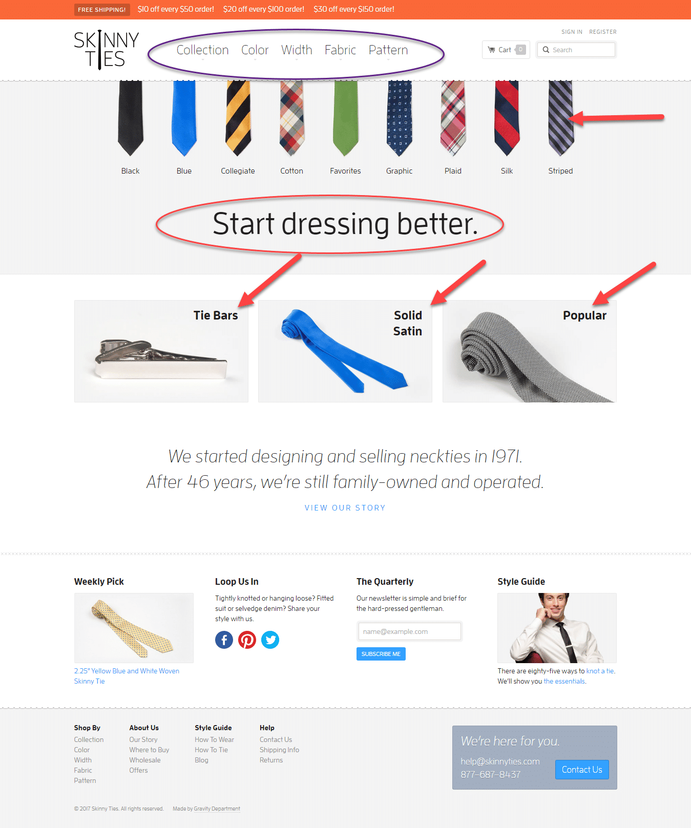
On the flip side, the updated version seems simple and more focused. Users do not need to spend mental effort scrutinizing the content; instead, they can focus on the main elements of the page easily.
In the updated version of the website, the designer has made smarter choices by packaging the previous information and making it easier for users to consume and understand.
The aesthetic aspects are crucial in making your website either more engaging or less appealing to your users.
In our Conversion Framework, this is called clutter, again under FUDs. Balancing whitespace and ensuring your overall design aesthetic is not too cluttered are key considerations in our heuristic evaluations. Sometimes, clutter can appear within a specific page area or at the element level. There are two considerations when we look at clutter:
- Is the information or element that is cluttering relevant?
- We must remove it and place it in a more appropriate location if it is irrelevant.
- If it is relevant, we need to reduce the size and space it takes up for
- Easier access to the information
- More whitespace and cleaner design
- Is this clutter actually causing a lack of trust and confidence among site visitors?
- Review analytics to assess.
- Consider creating events to see whether visitors are “clicking enough” in the areas you deem cluttered.
- Review heatmap data.
6. Match between the website and the real world: this principle emphasizes the necessity of having a website that speaks the users’ language using words and concepts that are familiar to them.
To understand this principle better, here is an example:
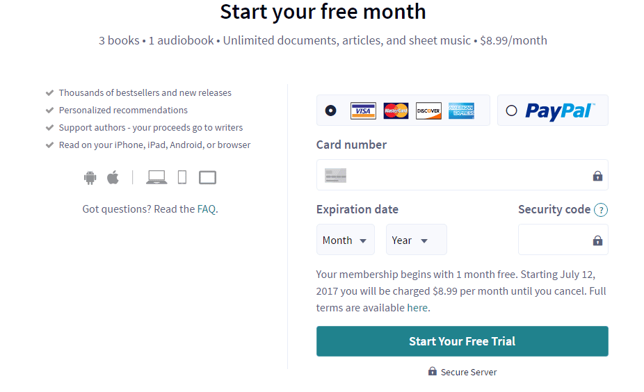
The requested credit card details match the actual credit card details, making it easier for the user to fill in the blanks without confusion.
In the Conversion Framework, we consider this an element of Trust and Confidence. Ultimately, if site visitors don’t understand your product or service’s technical specifications and information, they will not be confident enough to move forward with your company. Therefore, technical lingo and jargon need to be dumbed down to match visitors’ expectations, needs, and level of technical knowledge.
7. Control and the freedom of users: this principle emphasizes users’ freedom to navigate and undo accidental errors by providing them with an “emergency exit” to recover fast and easily from mistakes and clear paths to help them get back to where they want to be.

Image Source: blog.prototypr
Whether it’s breadcrumbs or a simple “Back” CTA, visitors need a way to get back where they started or sometimes the step before. It seems like a simple enough action to provide to visitors, but time and time again, we find that this particular Conversion Framework element (within FUDs) is ignored.
A simple rule to follow for any action on your site:
Don’t have your visitors always guessing what to do.
A recent client offered some discounts on their site through a slider that appeared at the bottom of the page. However, exiting the slider was very difficult and unclear, making what could have been a great experience a nightmare for site visitors.
8. Flexibility and efficiency of use: This principle states that the website should incorporate accelerators unseen by the average users but simultaneously allow the experts to navigate faster with more frequent actions.
Simply put, average users and experts should be able to use your interface satisfactorily.
Consider, for example, how experts and average users use the keyboard of a computer. Experts always prefer to use the keyboard accelerator shortcuts, while average users use the mouse and do almost everything manually.
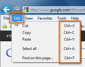
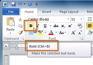
Image source: gcflearnfree
This particular heuristic falls under engagement in our Conversion Framework.
Within engagement, we state that keeping visitors on the site longer is important because research has proven that longer time = more likely to convert.
One aspect that we focus on at Invesp is creating a persona. By understanding the site visitor, you will decipher each persona’s level of technical savvy. You may have some visitors who aren’t very savvy, while others are quite skilled. Each of those personas needs to be considered when it comes to engagement. If your site offers traditional navigation, it may appeal to novice visitors but certainly not to skilled visitors. If you offer a widget for quick search, you change the game and appeal to the more tech-savvy visitor. However, knowing your visitors and meeting and exceeding their expectations is key to providing these varying paths or elements on your site.
9. Help users recognize, diagnose, and recover from errors: this principle states that error messages should be expressed in plain and direct language to indicate the problems precisely.
Always ensure that users understand what went wrong and what can be done to fix it.
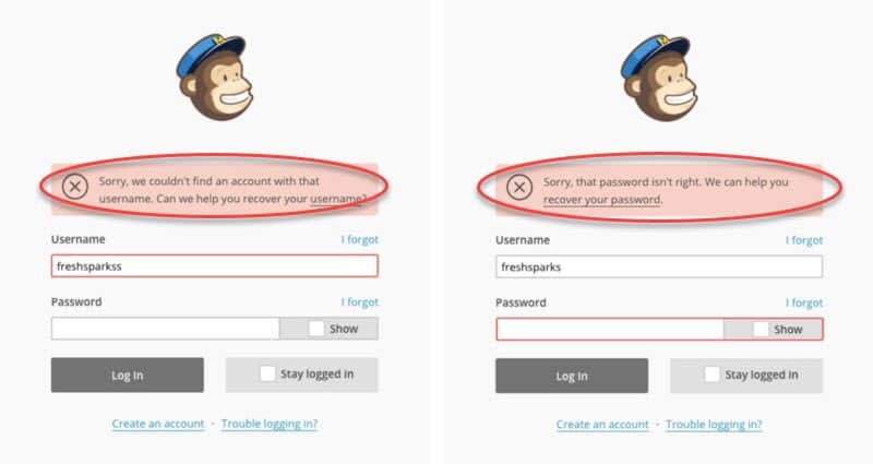
Image source: blog.prototypr
Returning to FUDs, error prevention and error instructional guidance are quite important. This means that the way errors are highlighted and visitors are directed to correct them becomes critical. There’s an expression in CRO that says: “Don’t make me think!” And that is exactly what your visitors expect from your site.
For example, when filling out a form and clicking to continue, users will have a frustrating experience if they can’t proceed, with no clear indication of why. The visitor should be informed either by being scrolled up to the error or by receiving a notice next to the continue button.
10. Help and Documentation: Even if the website does not need a help section or documentation to be fully understood, always make sure to provide it.
Below is an example of the Skyscanner help page, which provides a video explaining all the questions related to users’ bookings.
There is also a search field coupled with the frequently asked questions (FAQs) and queries on the same page.
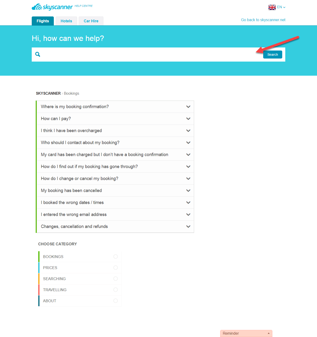
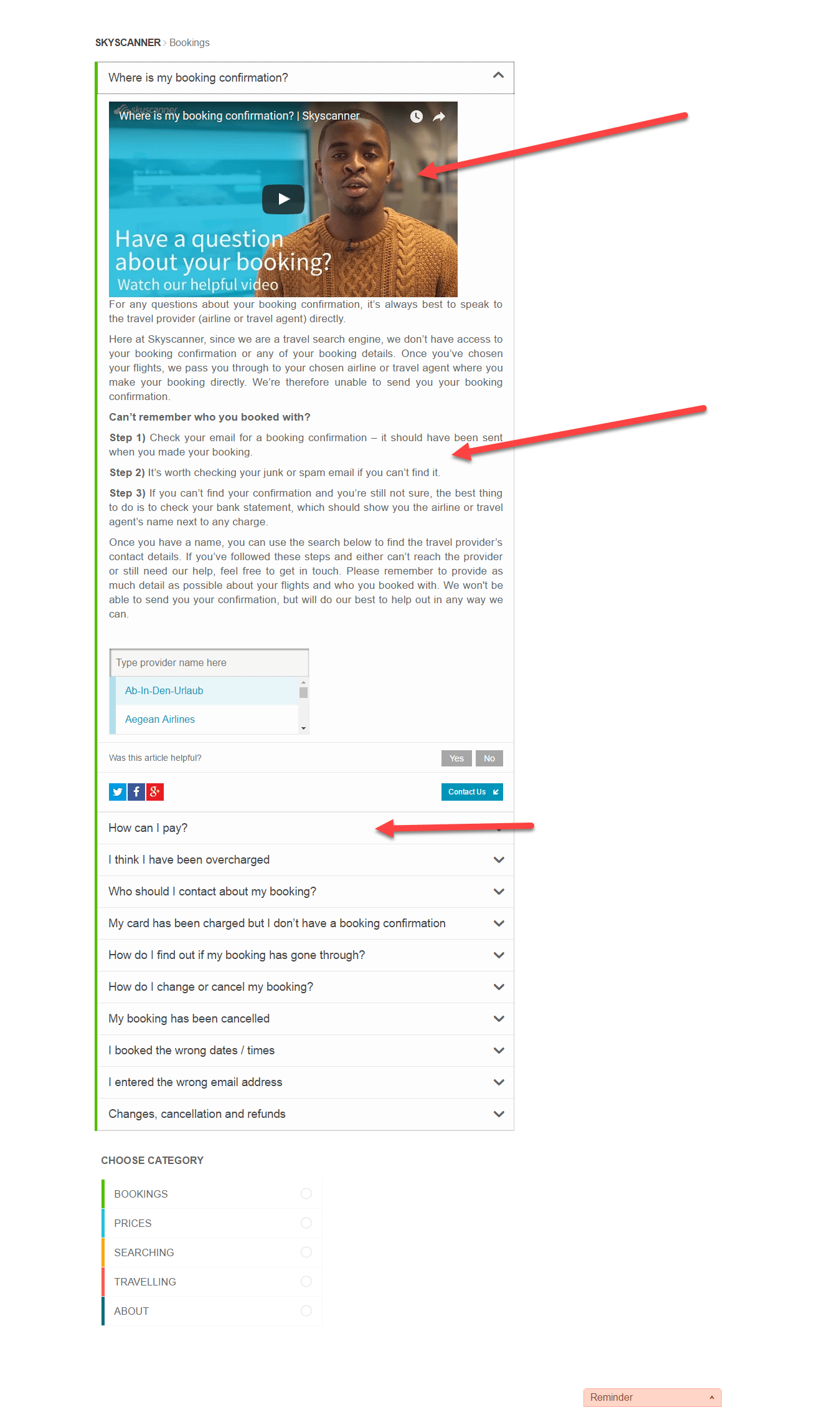
Within the Conversion Framework, there is an overall emphasis on countering FUDs and increasing trust and confidence. FUDs are often caused by a lack of information or clearly defined paths. This heuristic is about just that.
However, information needs to be placed in the right place for the visitor to identify it as well. Also, you can provide instructions in different ways: wizards, instructional graphics, videos, GIFs, FAQs, or simple “?” or “What’s this?” links that visitors can click to find more information.
The Steps of Heuristic Evaluation
As with any usability testing, when conducting heuristic evaluations, you must begin with a clear goal, even if what you discover is ultimately unexpected. With your goal in mind, you can follow two- or three-step methodologies to evaluate your website.
Based on the method explained in the nngroup article, heuristic evaluation is basically conducted through two main stages:
- 1. Inspection vs. the 10 Heuristics: This phase revolves around each expert inspecting the website independently, going through the different elements of the website, and comparing them against a list of recognized usability principles, the 10 heuristics. At the inspection stage, the heuristics are set into three categories based on their function: understanding, action, and feedback.
- 2. Problem aggregation: During this stage, the experts aggregate all the findings and start comparing and putting all the information into reports, or experts can verbalize their thoughts into comments to an observer as they go through the website.
At Invesp, we combine other forms of qualitative and quantitative data, basically the conversion framework and analytics, with our heuristic evaluations for two major reasons:
- This is to help us identify which parts of the customer experience on your website are most broken.
- To remove the guesswork, each problem we uncover during a heuristic evaluation is validated by analytics.
When it comes to the number of experts assigned throughout the evaluation, we believe it should not exceed five, because involving more experts won’t help and will generate additional work, especially during the sort-out phase.
Our methodology has three main phases:
- Playbook activities: As a preliminary step, the experts independently perform activities outlined in our playbook, such as signing up for a newsletter, placing an order, unsubscribing, and returning a product. While performing these activities, the experts do their best to align with users’ expectations and consider their perspectives. During each activity, the experts record what problems or difficulties they face, or areas they believe need improvement. Some of the issues may be bugs on a website, while others may be research opportunities for us to investigate further.
- Discussion: together, the group of experts goes through the site from the point of entry until an order confirmation page or a form submission. Using the Conversion Framework, the experts evaluate whether there are any issues requiring immediate fixes or further research and consideration by the team.
- Validation: To validate the information gathered, this phase includes qualitative research and an assessment of website analytics to determine whether these issues are apparent elsewhere. The validation strengthens the hypothesis to solve the uncovered problems. While the heuristic evaluation does not provide solutions or a systematic way to resolve the usability problems identified, the detailed explanations of experts and analytics analysis represent a great input to derive and generate suitable fixes.
When to Use Heuristic Evaluation
You can use heuristic evaluation at the different stages of your design process:
- Early stages of your design: no need to wait until your website is built. You can perform a heuristic evaluation early in the design process to identify potential problems and find solutions to improve the user experience.
- Before user testing: If you intend to conduct user testing, launching a heuristic evaluation beforehand will help you focus on the most valuable and important elements to test. This will save you from wasting your resources on identifying minor issues and issues that can be picked up automatically without effort.
- Along with other tests, you can use this methodology for more detailed, in-depth analysis of your website.
- Before redesigning, conducting a heuristic evaluation will help you identify which parts of your design to keep and which are more problematic and need redesigning. This can be done thanks to the rich qualitative feedback from peer critiques.
- When you need to pinpoint problems on your website, heuristic evaluation can help you articulate the issues you already suspect and make informed changes.
- Before releasing software, heuristic evaluation can help you with a final check of your design before it reaches a wider range of users.
Over to You
Being extremely powerful and cost-effective, heuristic evaluation doesn’t require you to set aside a budget to conduct; you can leverage existing resources in your company without worrying about the “how” questions often asked in other usability tests.
Heuristic evaluation is great, easy, and cheap to conduct compared to other usability methodologies.
Keep in mind that website inspection is at the core of heuristic evaluation, where each expert provides feedback on the website independently to avoid any biased evaluation.
You can ultimately use heuristic evaluation throughout the whole design process, and there is no need to wait till your website is built, as you can perform the evaluation at the website’s early stages.
You can also use this evaluation as a guideline to redesign your website and create a new version that provides a better user experience.
Invesp’s heuristic evaluation provides accurate results and enhancements, especially at the conversion level, when combined with our conversion framework.
Note that each CRO company has its methodology, but all heuristics are rooted in the same principles, which we share with any other usability or CRO group.