
When you’re looking to improve the user experience of your website, you can use the heuristic evaluation checklist. This checklist is a guide that will help you determine how good your site is for users.
The heuristic evaluation checklist is based on a list of common usability problems identified by Jakob Nielsen, an expert in human-computer interaction. The purpose of this list is not to give you a specific diagnosis for your website but rather to help you identify areas on which to focus when improving the user experience.
To put it simply, the goal of this checklist is to help you identify problems with your site that can make it difficult for users to find information, complete tasks, and use the site effectively.
Ten guidelines to follow when using the heuristic evaluation checklist:
1. Visibility of system status
Visibility of system status is an essential factor in any website evaluation. It refers to whether the user can tell where they are, what has happened, and where they are going.
The following checklist will help you evaluate your site’s visibility of system status:
- Are there any error messages displayed?
- Do users know what they should do next?
- Do users know how far through the process they are?
- Is there a clear indication of progress? For example, do users know how many more steps remain in a multi-step process or how many items are left in a list?
- Does information about time-out or time left display on a page?
You should also keep in mind if the overall layout is easy to scan? Are there any cluttered regions or large blocks of text that make scanning difficult?
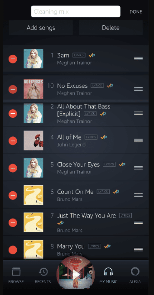
For instance, users of the Amazon Music app on iOS can directly control the order of items in a playlist. It is because system status is easily visible, and they can spot and correct an error.
(Source)
2. Match between the system and the real world
One of the essential aspects of heuristic evaluation is to match the system with the real world. This is often referred to as “fit,” or how well you can match the system to what people actually do.
A system that does not match its real-world context will not be accepted by its users.
If you look at Microsoft Win10 OS, you will notice that the recycle bin icon has been adapted from the real-world garbage bin design.

(Source)
Another thing to consider is whether real-life people would be interested in using a particular website feature or element.
For example, suppose you’re working on a web application that allows people to make reservations at restaurants. In that case, you need to ask yourself: “Are my users actually going to use this feature?” If they’re not, then it’s probably not worth spending time on that feature right now.
A good way to check this is by looking at other reservation systems and seeing how they work. You may find that they have some features in common with what you’re building, but also some areas where they differ significantly.
The following are some more important elements that need to be considered for this purpose:
- Ease of use – Is it easy for users to learn how to use the system? Are there many steps involved in its use? Can users understand what they need to do with a little bit of training?
- Performance – Does the system work quickly enough when responding to user requests? Do users get annoyed when they have to wait too long for their requests to be fulfilled? Is enough capacity built into the system to continue functioning even though too many requests are coming in at once?
- Error messages – Are error messages clear enough so that users know what went wrong and why? Is it easy for them to fix problems with their own actions, or do they have to contact technical support staff, who might take some time before getting back to them with an answer?
Another area where fit matters is when you’re evaluating the usability of a system’s design elements (such as buttons). For example, if you want people to register for an account on your website from home (where they have access only to their mobile phone), then it might not be useful for you to include a button labeled “Register Now!”
3. User control and freedom
The best user experience is one in which the user has a sense of control over what they’re doing. If you have ever used an app or website that forced you to do things in a certain way or limited your options, then you know how frustrating it can be.
Here are some common examples of situations where users lack control:
- Lack of Choice: Users don’t know what choices are available to them, so they don’t know how to use the site effectively. For example, if there are no filters for sorting search results, then users may not find what they’re looking for on your site because they don’t know how to filter by price, color, or size.
- No Feedback: Without feedback, users can’t tell whether their actions are successful or not. For example, if an action doesn’t produce any response from the site or interface (such as submitting a form), then the user doesn’t know whether their action was successful or not.
Your website should be easy for users to navigate from page to page, section to section, and from one feature to another.
It should also be easy for them to find their way around the site. It should be possible for them to get back on track if they get lost or confused. For example, a good design will ensure that there are no dead ends or loops in the navigation scheme of your website.
It will also ensure that if you have a lot of links on your webpage, they are organized in such a way that it does not confuse your users. This means that you need not have multiple levels of links that lead back to each other like so many circles within circles!
There should also be clear indicators on how users can move between different areas of your site without going through too many steps or obstacles.
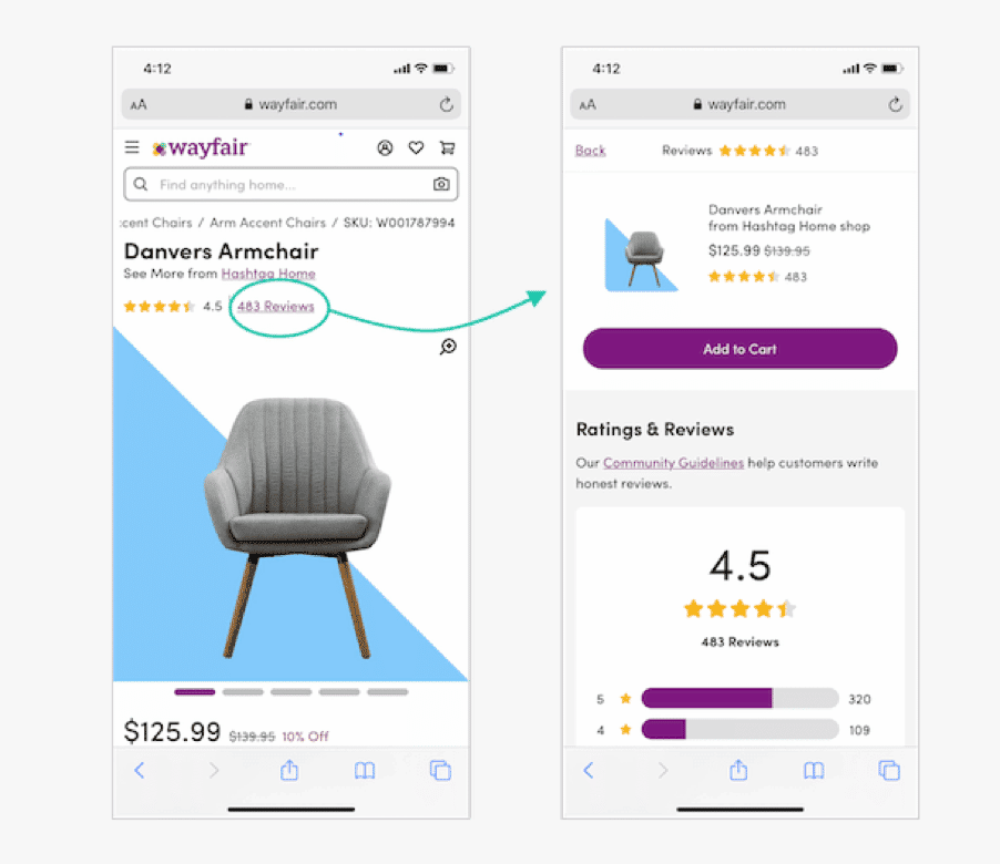
If you have used Wayfair.com, you know that when users click on the Reviews link, it opens an expandable drawer that takes up the full screen.
(Source)
Both the site’s and browser’s Back buttons take you to the initial product overview page, giving users control and freedom. Users can also swipe from left to right. This action closes the drawer.
4. Consistency and standards
This heuristic evaluation checklist is used to evaluate the consistency and standards of a website. It helps you ensure that the design, information, and behavior of your site are consistent.
Consistency and standards are important in evaluating a website. If the site is well-designed, it should be consistent in its use of colors, fonts, graphics, layout, and content. The information on the homepage should be similar to that on other pages, and navigation should be consistent throughout the site.
It’s important that your site is consistent in order to ease the navigation experience for users. This can be done by using certain elements on every page of your site so that they know what to expect when they click on any link or button within your site.
If a user clicks on an “About Us” link, then it should take them to an “About Us” page. If they click on a “Contact Us” button, it should take them to a contact form where they can fill out their details and get in touch with you directly from your website.
This type of evaluation can help you identify places where users might get confused about how things work on your site or where they might have difficulty finding what they’re looking for.
What’s more, according to Jakob Nielsen, there are two types of consistency – Internal consistency and External Consistency.
Internal consistency is a state where the visual elements in a design are harmonious with each other and do not contradict the overall look and feel of the site.
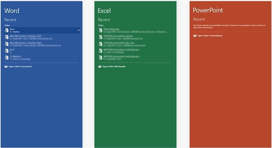
Here’s an example of Internal consistency from the Microsoft Office suite. Look at how it keeps consistency within a family of products.
(Source)
External consistency is a state where all pages across the site share a similar design, thus giving the user an overall feeling that they belong to one website.
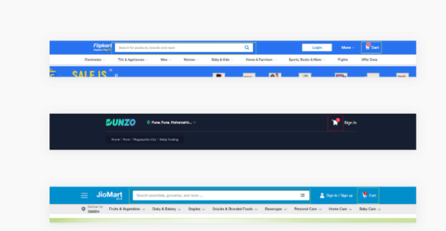
To understand External Consistency, look at Flipkart, Dunzo, and JioMart’s Cart icon and Search bar. They follow the user’s mental model.
(Source)
5. Error prevention
Error prevention checklist in heuristic evaluation will help you to find out if all the necessary information is present on your website if there are any usability issues, etc.
For example, if the information that users need to complete a task is not shown clearly, they will make mistakes more often than if the information was available.
If you want to test your website’s error prevention heuristic, you need to check if there are any problems that prevent users from completing tasks without any errors.
For example:
If you have an online store, do your customers know how much an item costs before they add it to their cart? Are there any other costs besides shipping? Will they be charged extra taxes or shipping fees? And what about hidden charges such as credit card surcharges or currency conversion commissions? The more details about pricing that are available upfront, the better it is for your business because fewer people will abandon their carts before they check out.
Error prevention also includes allowing users to undo their accidental errors.
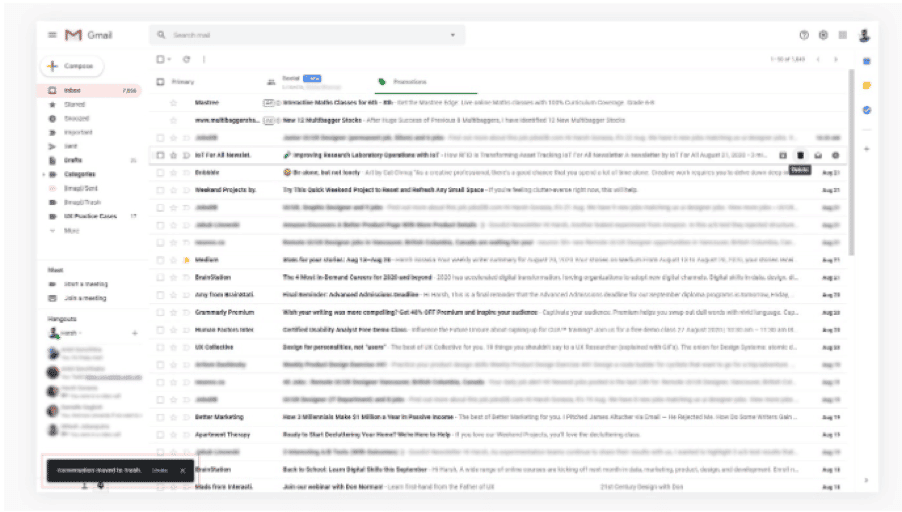
For instance, in Gmail, if you delete an email by mistake, you can still undo that action by tapping on Undo option.
(Source)
This checklist can be used by both users and designers who want to check their websites for errors before publishing them.
In addition, the following checklist should also help you prevent errors from occurring on your site:
- Is there a 404 error? If so, then it means that there is a broken link somewhere on your site. You should fix this as soon as possible by fixing the link or adding another page with the same content so that visitors don’t get frustrated looking for something that doesn’t exist anymore.
- Are all hyperlinks working properly? It may seem like common sense but sometimes people forget to check this before publishing their website! If a hyperlink isn’t working properly, then either remove it or fix it so that it works again.
- Are there any broken images or other images that aren’t showing up correctly?
6. Recognition rather than recall
Recognition rather than recall is a part of the heuristic evaluation checklist to use on your website. It is the ability to recall a fact or idea without having to search for it. It is the opposite of deep learning, where information is stored in long-term memory.
For instance, when you return to a site like Amazon and eBay, you will notice the home page shows you a list of items you have recently viewed, recommendations via your purchase, and browsing history.
(Source)
Recall has been studied by psychologists as it relates to memory and learning. According to the theory of recognition, each time we are exposed to something, we make a mental note of its features — what it looks like, sounds like, smells like, feels like — so that the next time we see that thing again, we can identify it more easily. This process is called recognition memory.
The key difference between recognition and recall is familiarity with something versus knowledge about that same thing. For example, if you were asked what your favorite color was, you could probably remember it based on past experience (recognition). However, if someone asked you what blue looked like (which happens more often than you might think), you would have to stop and think about the question before providing an answer (recall).
7. Flexibility and efficiency of use
Flexibility and efficiency of use are other parts of the heuristic evaluation checklist to use on your website. It’s a way to see how easy it is for people to navigate your site, find what they’re looking for, and perform actions. This category looks at the overall user experience and whether a visitor can accomplish their goals with ease.
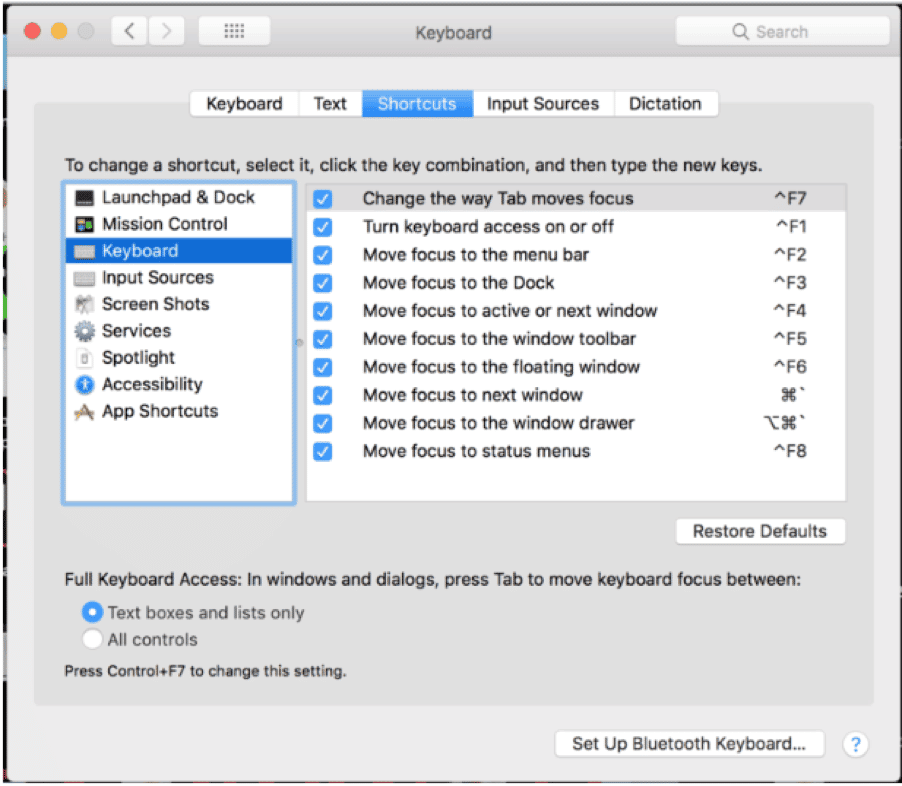
For example, software tools like Adobe Photoshop offer shortcut commands, such as commands for cut, copy, and redo-undo are common.
But there are a few commands subjective to the software. However, with frequent use, you become accustomed to them.
Similarly, Mac OS allows you to create customized keyboard and shortcut commands:
(Source)
A well-designed website should have:
- Easy navigation: Navigation elements should be visible, clear, and intuitively placed so visitors can easily reach them. If there are multiple levels of navigation, make sure that each level has its own set of links that take users back to where they came from or forward to where they want to go next (i.e., breadcrumbs).
- Consistent navigation: If you have more than one page with navigation elements, make sure the buttons look and behave the same. Don’t mix icons with text labels or different styles of buttons; these differences can confuse users when they’re trying to find their way around your pages.
- Helpful error messages: Error messages should be clear and actionable, so visitors know what needs fixing before they submit an order or contact us form. Error messages should also be as short as possible (no more than three lines).
8. Aesthetic and minimalist design
Aesthetic and minimalist design is an important aspect of website development that needs to be considered right from the start rather than as an afterthought when it comes time for final testing with users.
Aesthetics refers to the sensory perception of beauty – a theory of qualities based on the pleasure experienced through the senses. Aesthetics is not simply about pleasing the senses. It also involves a sense of balance and harmony in things, even if they are not necessarily natural.
Minimalist designs create a more subtle experience, allowing visitors to focus on the information they need rather than being distracted by unnecessary elements.
The following are some of the guidelines that you should consider when designing your website:
- Use a simple, clean, and consistent layout.
- Minimize the use of graphics and photos.
- Use high-quality images where necessary.
- Use typography that is easy to read and pleasing to the eye.
- Keep page backgrounds simple and light-colored so their content can stand out more clearly.
- Make sure that all text is sufficiently large enough for easy reading (at least 14 points).
- For every web page, ensure a clear navigation menu for finding pages within your site or linking to other sites (i.e., a site map).
Take a look at these two websites examples from Webdesign-Inspiration:

(Source)
The first site uses a vertical layout. The scrollbar is on the side. Since this is a landing page, it has the logo, menu, and CTAs. There is no detailed information or clutter, allowing users to understand the site’s purpose quickly. The CTA is also attention-grabbing.
The second example is of a landing page with a full-width layout. Scrollbars are not present, making it easy for users to see and access all the possible interactions at the initial load of the interface.
9. Help users recognize, diagnose, and recover from errors
A common problem with websites is that they do not provide a clear indication that something has gone wrong. Users may be left wondering what has happened and how to fix it.
Reduce cognitive load by only showing users errors when they need them. Remember that users will close the tab if they cannot figure out what went wrong. Also, don’t make them guess what went wrong – give them an error message that tells them exactly what went wrong, with as much detail as possible.
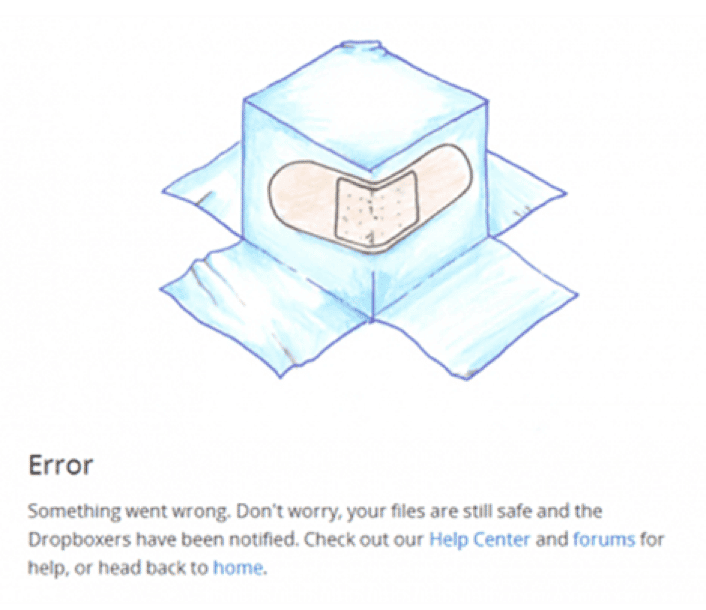
Here’s an example of a Dropbox error message showing “Help” that allows users to recognize, diagnose, and recover from errors.
(Source)
And here’s another example from YouTube:

(Source)
It tells users that they are offline, yet they can still view the downloaded videos.
10. Help and documentation
It’s important to have help and documentation available for your website because when people visit your site, they may not know exactly what they’re looking for or how to navigate through your site.
If you don’t have any help or documentation on your site, then users will likely leave and not come back because it’s too complicated for them. But if you do have help and documentation available, then users will feel confident in their ability to find what they’re looking for and will be more likely to stay on your site longer.
Here’s a quick Help and Documentation checklist you should consider:
- Does your website include a help or support page?
- Is it easy to find?
- Is it clear what you can do on this page?
- Do you have an email address to contact for support?
- Is there a contact form on the site or elsewhere that allows you to send feedback or ask questions?
Whatfix has brilliant documentation that allows users to know how to use their technology. The Getting Started guide on their first page helps new users in the onboarding process by letting them know what Whatfix is all about.
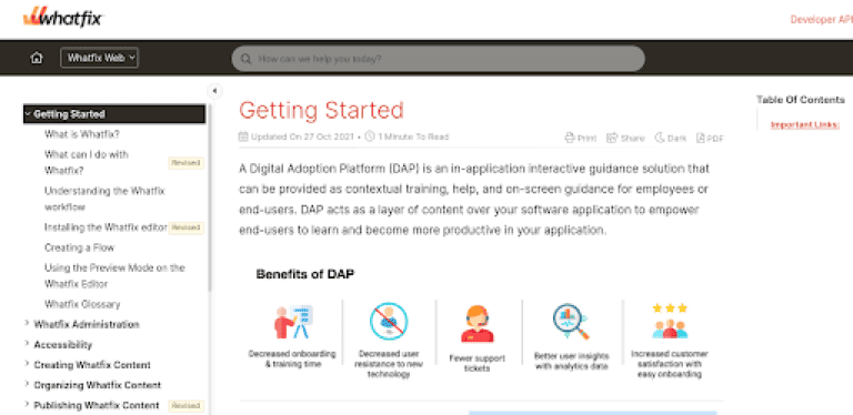
(Source)
They also have a Getting Started explainer video about the software use.
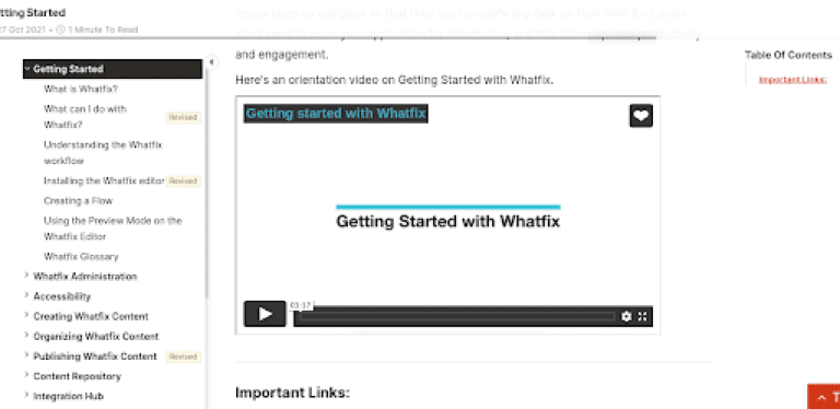
(Source)
Plus, Whatfix showcases its knowledge base content in a visible left-hand menu.
On a separate article page, Whatfix users can even request a demo. It is because many of their documentation users are probably prospects trying to learn more about the platform.
There’s also an option to contact the support team if you can’t find what you were looking for via an email address.
Final Thoughts.
With the checklist above, there’s no reason not to give your site a once-over. This is especially important if you’re adding new functionality to your site, but even just a regular site update can benefit from this type of review – especially if you haven’t used your website in quite a while.
If you can implement these recommendations, your users are likely to rate your website as more usable and find it easier to achieve their goals. Your business may also find it easier to achieve your objectives as a result of having a more functional website.
Heuristics Evaluation FAQs
1. What are usability heuristics, and why are they important?
Usability heuristics are a set of principles or guidelines used to evaluate the user-friendliness of interfaces. They are essential because they provide a standardized framework for assessing and improving user experience.
2. What is a Usability Heuristics Evaluation Checklist?
It’s a systematic list of criteria based on usability heuristics that experts use to assess the design of a website or application, ensuring it aligns with established usability principles.
3. Can you provide an example of a widely used set of heuristics?
The Nielsen Heuristics, developed by usability expert Jakob Nielsen, is a popular set of ten heuristics widely used for evaluating user interfaces.
4. How is Heuristic Analysis different from other usability testing methods?
Heuristic analysis is an expert evaluation method where usability professionals systematically apply established heuristics to identify usability issues. It differs from user testing as it doesn’t involve direct user interaction.
5. What does a Heuristic Evaluation Template include?
A template typically includes a list of heuristics, space for evaluators to note issues, severity ratings, and recommendations for improvement, creating a structured approach to the evaluation process.
6. How does Heuristic Evaluation contribute to User Experience (UX) design?
Heuristic evaluation helps UX designers identify and address usability issues early in the design process, leading to improved user satisfaction and a more efficient and effective user interface.
7. Can Heuristic Inspection be used for both websites and mobile apps?
Yes, heuristic inspection is a versatile method applicable to various digital interfaces, including websites, mobile applications, and software platforms.
8. Are Heuristic Evaluations only performed by usability experts?
While usability experts commonly conduct heuristic evaluations, they can also involve individuals with a strong understanding of usability principles, making it accessible to a broader range of professionals.
9. How often should Heuristic Evaluations be conducted during the design process?
Heuristic evaluations can be performed at different stages of design, including early conceptual phases and later stages before launch, to catch and address usability issues at various points in the development process.
10. What is the primary goal of Heuristic Analysis in UX design?
The primary goal is to uncover and address potential usability problems based on established principles, enhancing the overall user experience and ensuring the efficiency and effectiveness of the interface.
11. How do you conduct a Heuristic Evaluation?
To conduct a heuristic evaluation, start by selecting a set of usability heuristics, such as the well-known Nielsen Heuristics. Assemble a team of evaluators, including usability experts and stakeholders, and have each member independently review the interface, noting usability issues aligned with the chosen heuristics. Compile individual evaluations into a comprehensive list of issues, including severity ratings. Provide actionable recommendations for addressing identified problems and enhancing the user experience. The process is iterative, allowing for refinements based on feedback until usability goals are effectively met.


